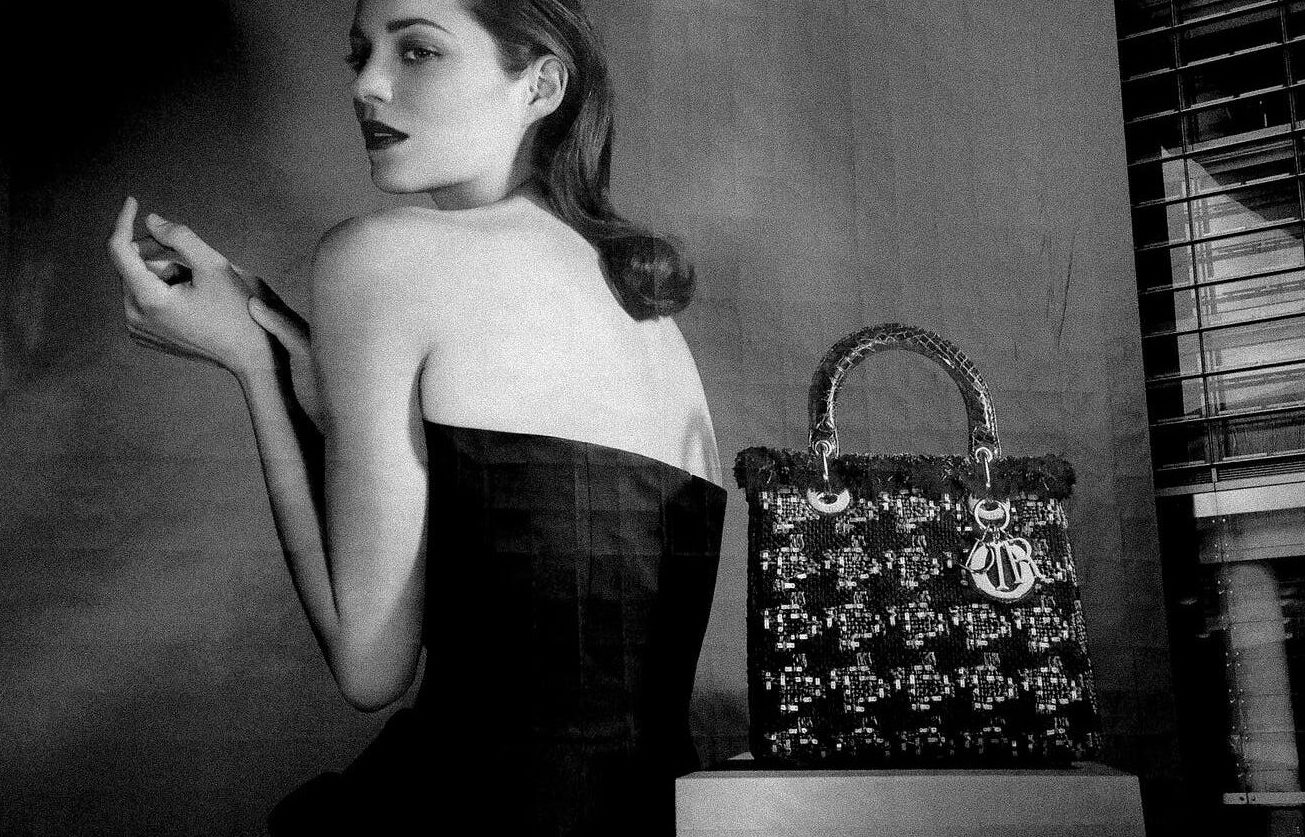
The purpose of the poster is to call and persuade. It should be businesslike, very clear and understandable. And since the life of the poster does not take place in exhibition halls with special lighting, but in the most random places – either in the rain, or in the sun – the poster should be able to do its job under any circumstances. Both the content of the poster and its form must be striking. Such is the ideal of beauty in the poster. That is the specificity of the poster. The standard of artistry in the poster is different from that of painting or easel graphics.
Its specificity also lies in the fact that the great content, the big idea should not be expressed in hundreds of pages of a novel, not in thousands of shots of a film, and not on any size canvas of a multi-figure easel composition, but only on one standard sheet of paper. At the same time, with a small sheet of paper, the poster must operate with large images, otherwise it will not be sufficiently noticeable. A poster that is displayed in a variety of conditions is very sensitive to both format and size. And the larger and more varied they are, the better.

When working on a poster, the artist is obliged to make it sharper and sharper and thus increase the level of its impact on the viewer. Therefore, the question of the sum of the techniques that make the poster most effective is not superfluous, but on the contrary, is practically important.
Now in poster art one can trace the increased ability of artists to give an in-depth interpretation of the image, one can see certain achievements in the embodiment of the idea.